Value of the Exam
✍ The Tableau Certified Data Analyst Certification adds a dazzle to your portfolio in the world of Visualization and Data Analytics. The test assesses your ability to comprehensively perform advanced analytical activities. By this test, Tableau confirms you are well-acquainted with all the functionalities of the product and also can solve complex problems.Cost and Expiry
✍ The Tableau Certified Data Analyst Certification cost is $199. The Validity of the Data Analyst certificate is 2 years. To pass the Tableau Certified Data Analyst Certification Exam you need to score 75% from 70 multiple-choice questions in 150 minutes. Our free Practice Test with sample questions below will give you a complete experience of the main exam.Official Exam Guide
✍ You can download the Exam Syllabus from the 'References' section in the Menu above. There is no eligibility criterion for the Tableau Certified Data Analyst Certification Exam, however we recommend you to be working in Tableau for atleast 20-24 weeks before taking this exam. For mock tests, complete our Tableau Certified Data Analyst Practice Exam below. To schedule the main exam with Tableau when you are ready, choose 'Schedule Exam' from the References Menu above. You can read more on the official Tableau site.Planning the Actual Exam

BUY @ $11 / MON BUY @ $60 / YEAR LOGIN LIVE HELP @ $37 / MON
✍ Welcome to the Free Tableau Certified Data Analyst Certification Practice Exam. This exam is more detailed and has tougher questions than our Free Practice Exam for Tableau Desktop Specialist Certification. You will be assessed on more complex scenarios and problems which you are expected to solve using Tableau. Every question here have been delicately created by our Certified Tableau professionals, and will challenge you with complex scenarios from various topics. Our pool of Tableau resources continue to grow every day, making this test even better with time. All our questions in this practice exam are part of the course content for this certification.

✍ Refer the 'References' section from the Menu above to get the Data Analyst Guide. With this practice exam, you will get a good vibe of what the actual exam feels like. Even more challenging content awaits you in our Tableau Certified Data Analyst Certification Premium Exam. If you are struggling on some questions during this practice exam, or if you are not able to pass this practice exam, or if you score 100% in this practice exam, chances are you will get similar results in the actual exam.
✍ The passing score in this test is 75%. You will have 70 new questions in every attempt. Time limit is 150 minutes. Much like the actual exam. Please do not refresh the page during the exam. The Datasets for the test are available in the menu above.
How to Create a Rounded Bar Chart?


How to Create a Lollipop Chart?


How to Create a Barbell Chart?


How to Create a Bar in Bar Chart?


How to Create a Stacked Bar Chart?


How to Create a Radial Bar Chart?


How to Create a Radial Column Chart?


How to Create a Doughnut Chart?


How to Create a Pareto Chart?


How to Create a Gauge Chart?


How to Create a Thermometer Chart?


How to Create a Span Chart?


How to Create a Waterfall Chart?


Buy Practice Exam
✍ We are extremely glad to offer you the opportunity to practice our Tableau Basic tests for free. But there is a limit to the number of attempts in our free quizzes. We are delighted to present you with our Premium Tableau Certified Data Analyst Exam with a fascinating collection of spectacular questions. ✍ Enabled with our Vision algorithm, the Premium Exam scans our pool of thousands of popular questions from every Tableau category in each test. You will be presented with an unique set of creative, powerful, and dynamic questions in every attempt. Choose below and your exam will start immediately.
✍ With the incredible versatility of the Tableau Certified Data Analyst Premium Exam, you can be sure of your preparation for the Certification Test from an all-round perspective. You will not need to retake the Test for another $199. Experience the tremendous analytical capabilities of Tableau with unmatched ease of use in all our examination questions. ✍ If you are serious about a Tableau career, buy our Tableau Data Analyst Lifetime plan below. After buying, login here and watch your skills improve. The Tableau Data Analyst Certification Lifetime plan provides you comprehensive exposure to variety of Tableau scenarios from different datasets. Increasing your chances of succeeding with a high score in the actual Pearson VUE Tableau Data Analyst Certification Exam which is worth a few hundred dollars.
Already purchased? Begin exam here. 56% OFF Yearly
Scope
✍ The Tableau Certified Data Analyst Certification Exam evaluates the knowledge required for an individual to perform advanced analytical tasks using Tableau. This means you must be able to derive complex insights from data using the tool and be ready to create calculations if needed instantly as and when required. Some of the main concepts of Order of Operations, Level of Detail expressions should be at your fingertips and there cannot be any delay in answering or implementing these concepts.Essential Training
✍ We expect you to be thoroughly familiar with the topics in the Tableau Help Guide. But we do understand it is not possible to retain each an everything, so do keep practicing as many quizzes as possible to revise and improve your knowledge retention. The Tableau Tutorial Videos are a must-watch if you have not taken any other online courses, the videos are bite=sized and a few of them can easily be completed in one seating. Thus with a few seatings you can cover most of the training videos.Real-time Evaluations
✍ If you are not sure about your preparation, and wondering whether you are ready to pass the expensive examination, take our practice tests here and assess yourself. If you pass our mock tests, give yourself a pat on the back! If you are struggling in any of the problems here, you will surely struggle during the actual exam. So we recommend while taking our practice tests, after every incorrect answer, review our explanation and solution provided carefully for 15-20 seconds before moving to the next one. This way you will increase your chances of scoring higher with every attempt.Order of Operations
✍ We want to emphasize on Tableau Order of Operations and the critical role it plays in the Tableau world. It is highly recommended that you get comfortable with it with as much practice as required. Let's visit something which we are already familiar with to understand the significance of Order of Operations. Do you remember PEMDAS (US), BEDMAS (Canada, New Zealand), or BODMAS (UK, Pakistan, India, Bangladesh and Australia), BIDMAS (UK) when you were learning Mathematics?✍ In mathematics and computer programming, the order of operations (or operator precedence) is a collection of rules that reflect conventions about which procedures to perform first in order to evaluate a given mathematical expression. Using these conventions we eliminate notational ambiguity, while allowing notation to be as brief as possible. Where it is desired to override the precedence conventions, or even simply to emphasize them, parentheses ( ) can be used to indicate an alternative order of operations (or to simply reinforce the default order of operations).
✍ For example, (2 + 3) × 4 = 20 forces addition to precede multiplication, while (3 + 5)² = 64 forces addition to precede exponentiation. If multiple pairs of parentheses are required in a mathematical expression (such as in the case of nested parentheses), the parentheses may be replaced by brackets or braces to avoid confusion, as in [2 × (3 + 4)] − 5 = 9.
✍ In Tableau, we have a similar set of Order of Operations which is handling our queries all the time whether we use them explicitly or not. Let's take a look at each of the Operations and their Order.

✍ Extract Filters can be defined as pre-condition filters before Extract creation. The Extract Filter is used to filter out the data while creating the extract. Example: Let’s say we have database with the data for different countries as shown below: USA - 5000 rows, Canada - 2000 rows, India - 10000 rows, Australia - 1500 rows If we apply the Extract filters to bring the data only for USA (Country=USA), Tableau creates the Extract (.tde) just for the Country USA and ignore the data for all other countries. Size of the Extract is always proportionate the Extract filters.


✍ Dimension Filter is the default behavior when we add a Filter say for USA (Country=USA). One of the most common type of confusion we encounter is when to use Dimension filter and when to use Context filter. If we already have a Context filter on UK (Country=UK), then my USA Dimension filter will return zero rows. This is because Context filter is applied before Dimension filter in the Order of Operations.
✍ Measure Filter is pretty straightforward. We can see it in active use when we simply drag a Measure (say Sales) to the Filters Shelf and use to limit data for a range say from Sales value 1000 to the max possible value. We can choose Sum of Sales, or right click and drag Sales to the Filters Shelf to see more aggregation options.
✍ Let's consider a scenario where we want to add Category filter on Furniture, but do not want our Total Sales value to change. This can be created by creating a calculation called Total Sales as { Fixed: Sum( Sales) }. Now if we add Total Sales and Sales both to our view along with the Category Furniture filter, and Sales > 1000 filter, we will see Total Sales still shows the overall Total Sales ignoring all filters, whereas Sales shows the resultant Sales value calculated after applying the Category and Sales > 1000 filter.


✍ The remaining dimensions, upon which the table calculation is performed, are called addressing fields, and determine the direction of the calculation. The direction in which the calculation moves (for example, in calculating a running sum, or computing the difference between values) is determined by the addressing fields.
✍ The most frequently used Table Calculations are LOOKUP (expression, [offset]), ZN (), TOTAL (), WINDOW_AVG (expression, [start, end]), ABS (), RANK (expression, ['asc'|'desc’]), INDEX (), FIRST (), LAST(), and CONTAINS (expression, expression to search for). The below presentation demonstrates examples of each of these important functions.

Mandatory Tutorials
✍ We would recommend the below tutorial videos for your learning. This is our curated collection of some of the best tutorial videos on Tableau to help build a solid foundation. Each of the videos detail on various aspects of the tool and practical use-cases. Even if you are not able to complete watching the below Tableau tutorials in a single seating, make a plan to revisit them until you are confident of your skills. A strong Tableau foundation will ensure you are able to handle tough questions down the road and build an impressive profile with more complex activities.


✍ One of the most common questions we get asked is about our experience with the Tableau Certified Data Analyst Certification Exam, or how do we pass the Tableau Certified Data Analyst Certification Exam. We will explore more on this now, and provide you with essential guides and key best practices that you can implement before and during the exam. This will help you acquire the coveted Tableau Certified Data Analyst Certificate in a single attempt. Learn more on our Top Tips to pass the Tableau Certified Data Analyst Certification Exam.
Tip #1: Know your Exam
✍ Understanding what the exam evaluates you on helps anticipate key patterns and predict the types of questions. We would want you to go through the Tableau Certified Data Analyst Exam Guide from the References section of the Menu above. Also solve the sample problems in the guide to get a crisp idea of the entire exam. The questions in the Guide are designed to touch upon all the topics of the Exam, and these free questions will help you assess how difficult the Tableau Certified Data Analyst Exam is. If you are struggling in any of the questions, keep a note and then revisit the topics to improve your knowledge.Tip #2: Essential Videos
✍ If you have not taken any online courses yet, we would recommend to fully complete the Official Tableau Tutorial Videos besides other text guides you might be referring. The visual presentation of alteast one video tutorial course will equip you with an end-to-end experience of the tool. Moreover, the official Tableau video tutorials are of excellent quality and provides small tutorial videos on each topic that can be watched sequentially. Complement this with the Official Tableau Help Guide as you proceed, and you have a winning combination of video and documented tutorials. Read more on Tableau Tutorial Videos in the 'How to Prepare' section above. Let's take a look into some videos for Advanced Learning.✍ Table Calculations is a key analytical tool to perform various analytical tasks and creating visualizations. The below tutorial by Tableau Ambassador Anthony Smoak provides effective insights in this topic. It will help you realize the what, why, and the how of behind the scenes actions as we use the Tableau Table Calculations. ✍ Table Calculations continues to fill our world as we are presented with another spectacular video from Tableau Zen Master Andy Kriebel. Andy is also the Head Coach of The Information Lab Data School in London. You will learn some interesting use cases of Table Calculations, and why they form an integral part of Tableau. ✍ Level of Detail (LOD) Expressions is a key concept to fully tame the prowess of Tableau. Bora Beran, Product Manager at Tableau, walks us through FIXED, INCLUDE, EXCLUDE and more in this thoroughly detailed video on Tableau LODs. Knowledge of Level of Detail Expressions is essential for the Tableau Certified Data Analyst Certification Exam to solve practical problems effectively. ✍ Parameters in Tableau allow for an increased level of flexibility to the end-user. Values can be selected from a menu, or provided manually, to retrieve analytical results dynamically from stunning dashboards to perform in-depth and interactive analysis. The below tutorial by Tableau Zen Master Andy Kriebel helps us understand the capabilities of a parameter and how it fits into our analytical world.


Tip #3: Key Focus Areas
✍ The Tableau Certified Data Analyst Certification Exam tests you on various Conceptual and Practical Questions which you need to answer correctly. For the overall guide and topics included in this exam, please download the Exam Guide from the References section in the Menu. Among them, we would want to highlight a few key areas which will help you keep those % points intact. Firstly, be very thorough with all the Level of Detail expressions. The next key topics are Order of Operations, Table Calculations, and Chart Types. It is important to be fully aware of the intricate details of Chart Types, say the First Quartile of a Box and Whisker plot. ✍ The additional concepts that we need to be completely aware of are - Extract vs Live connections, Blends, Joins, Unions, Reference Lines and the ANOVA table, Interactive elements in Dashboards, designing a Story, Dimension, Measure, Discrete and Continuous fields. These are some of the key areas where candidates tend to stumble when questions get complex, or when the scenarios presented are unique. With consistent practice and practice tests, these topics can be brought under control.Tip #4: Practice
✍ Practice is the heart and soul of Tableau. Our recommended practice experience for the Tableau Certified Data Analyst Certification Exam is 20-24 weeks. Strategic reading, practical problems solving, and frequent real-time evaluation assessment tests with unique sets of problems are crucial aspects of getting ready for the exam. You will find you are saving more energy for the complex problems during the main exam after you practice our unique tests. Since every practice test at LearnTableau.Technology gives you a unique set of questions exactly like the main exam, you can be confident of your preparation if you consistently score well in our tests.Tip #5: Google
✍ The Tableau Certified Data Analyst Certification Exam does not allow candidates to search for information online during the exam. A few key tips needs to be mentioned so as not to get impacted by this restriction. Be acquainted with all the customization options offered by the tool. This is because in many cases we perform analysis in Tableau without actually being conscious of the steps we are doing, since we are good at it. Such multiple-choice questions can become tricky without the tool infront of us. Also, be thorough with the Tableau Help Guide which will help answer questions in the hands-on section, because the PDF of the Help Guide is provided in the hands-on section.Tip #6: Get to the answer
✍ During the Tableau Certified Data Analyst Certification Exam, remember that the goal is to arrive at the answer by any method that works. Tableau does not enforce any specific approach to get to your answers as long as you get it right. Thus whether you create a Country filter to derive the Customer Sales, or you write a FIXED calculation to filter by UK does not matter. The more you are comfortable with Level of Detail expressions, Table Calculations, Order of Operations, Types of Joins - the easier it will be for you to tackle the questions during the exam.Tip #7: See the smaller pictures
✍ The questions in the Tableau Certified Data Analyst Certification Exam will often contain multiple criterion attached to it when processing a scenario. If you have been practicing our mock tests here, you will start to get a feel and get used to it. To avoid risk of rework, it is important to remember during the exam to first pay attention to these smaller building blocks which often has a variety of filters and aggregation logics. Once these are in place, you know you have the view ready on which you can analyze to derive your answers.
Tableau assesses your skills on different categories - Concepts, Simplifying and Preparing Data, Chart Types, Analyzing Data using Calculations, Deriving Trends, Forecasting, Statistical Analysis, and creating Insights by Interactive Dashboards. You can download the Data Analyst Guide from the 'References' in the Menu above. Being strong in only one area and appearing for the exam can prove fatal. Unless you are well adept in every area, you are taking a gamble on your luck. Improving your score in Tableau is possible only through rigorous practice and well-planned topic areas to study. If you would like further guidance, take our practice tests, then use the Contact option from the menu and reach out to us. Mention which email id you used to give the exam and when you gave the exam. We will review your results and send you a personalized feedback.
Well, we encourage Learning Tableau. The concept of dumps is not appreciable at all. It never helps learning, and is counter-productive. So if you are looking for a quick way to pass the test, Tableau does not work that way. However, if you can pass all our quizzes comfortably, we guarantee you will pass the main exam. That sounds even better than a dumps, right? You can read more here about our Tableau Certification Dumps.
What You Should Know About Bar Charts?
When we talk about data visualization in Tableau, we mean bar charts. Even though Tableau deserves ‘kudos’ for implementing different fundamental types of charts that can present your data in the finest way like line graphs and scatter plots, bar charts are still the thing. Bar charts have the flexibility of ease of use and they are easy to understand.
Since bar charts are used to compare categorical data, the secret behind their success is because they take benefit of a basic attribute that can easily catch our eye - length. Once we see the bar chart and the length of the bars, we can observe and process the data in an efficient and accurate way. Simply said, even on first sight, once we see that one bar is longer than another one, we immediately get an impression that that specific category has more value than the other. This is why, bar chart without doubt, is the most powerful data visualization tool of all time available to us.
Since Tableau has a lot of charts to offer, they are grouped based on the information that you can display with a specific visualization. Bar charts are part of the family of charts that present Magnitude. This term shows the relative value or size of two or more discrete fields. For example, if you are willing to compare the total sales for different regions, you are looking at magnitude. The magnitude charts are bar charts, line charts and packed bubble charts.
First, before creating the bar chart itself, you should think about what questions can this chart give the answers to. By doing that, you can create some expectations of how you want your chart to look like and if this type of chart will present the data in a way that you need it to be.
Some of the questions that bar charts can give answer to are:
- Which of the dimensions has the highest value?
- Can we spot some exceptional dimensions?
- How big is the gap between the lowest and highest measure?
Once we are aware of what bar charts can do for us, it is time to make them even more engaging and catchy. In this article, we will share some tips on how you can upgrade the design and the functionality of your bar charts.
Take Advantage of the Basic Editing Available in Tableau
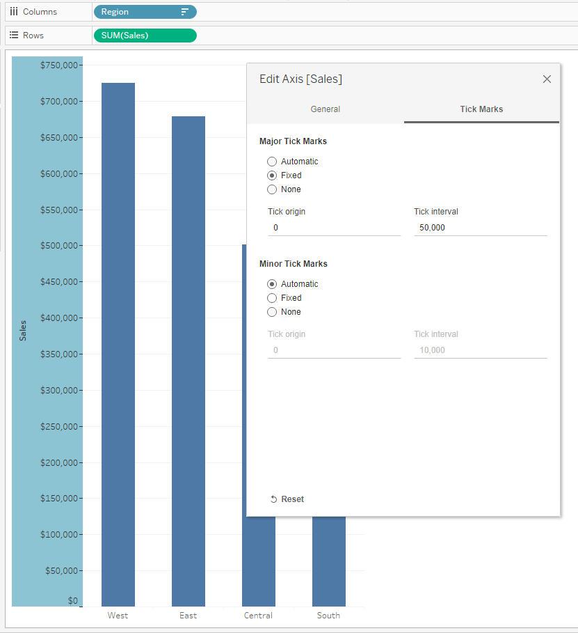
One of the things that you can do is use the formatting options that are already available for you in Tableau. First let's take a look at this bar chart, that shows the total Sales by Region.

We can immediately spot the ‘easy-to-read’ feature of the bar charts. We can see that the West Regions is leading its way with over $700,000 in sales. After it, the East Region is also doing good with almost $700,000 in sales as well. And at least, the South Region does not display some good results. However, there are few things that you can do to make this chart more effective.
The first thing that we would consider doing is widening the charts a little bit so we can put a spotlight on every category separately. You can widen the charts by sliding the right corner of the chart box to the right. But widening the chart box itself, will increase the width of the bars and make them too heavy relative to the rest of the visual. That is why afterwards, we will reduce the size of the charts by going on Size in the Marks shelf and drag the slide to the notch in the middle.

Next thing you want to do is hide its sheet name. You can do that by right-clicking on the title itself and choosing “Hide Title”. Also since the naming of the bars is informative by itself, there is no need to keep the ‘Region’ above the chart. You can hide right-clicking on the bar chart header, “Region” and “Hide Field Labels for Columns”. Please note, that if this is a standalone visualization, you should consider keeping the title. Also, while you are there, you would want to sort the bars in an ascending or descending order so you can get a clear picture of which region has the highest and lowest total sales.

Since between the highest and the lowest measure we have a difference of almost $350,000, it will be more convenient to add more gridlines and axis marks. That way, we can see the values of the bars more accurately. But on the other hand, if the variance between your bars is limited, you should consider removing unnecessary gridlines and axis marks. To increase or reduce the number of axis ticks, we should right-click on the vertical axis and click ‘Edit Axis’. Navigate it to the Tick Marks tab. As we can see the Tick Marks interval is set to 100,000. For our case, it will be more convenient to set the interval to 50,000.
Last but not least, we should pay attention to - color.
First of all, be sure to avoid double encoding. Since the bars in the chart are already separated by region, adding the ‘Region’ field to the Color Marks card will just be unnecessary and will make this chart confusing.
To make the visual a little easier on the eyes, you should consider reducing the opacity to something like 80%. This will reduce the saturation of the color of the bars and make the chart more subtle.
One cool thing about visualization is that you can use it as an opportunity to promote the colors of your brand or your end users’ brand. If you can’t decide which color to use, using the primary or secondary color from the brand is a good decision. Also for emphasizing, you can add a subtle border to the bars. You can find this option in the Color Marks Card.
If It Is a Standalone Visualization, Use a Baseline Instead Of Axis Marks
If you are creating this visualization with a goal to use it within a specific dashboard, axis marks will do their job and present the data in a good way. But if we are talking about a standalone visualization and you want to present the actual numbers in order to make a point, you should definitely consider hiding the axis and adding labels to the bars. In order to achieve that, you should right-click on one of the bars, go to Mark Labels and choose ‘Always show’. In the meanwhile, you can hide the axis.

If you are using this visualization independently, you can change the font size so the labels can be more easy-to-read. Also, what you can do is add a solid foundation for the bars so they don’t appear as floating. This will be very practical and will enhance the overall design. For both changes, you should click right-click on the view and click Format.
A formatting pane will appear on the left. Regarding the font change, first you need to make sure that the Font tab is selected above ( the symbol A ). Then, choose one of the different drop menus depending on where you want to affect the font. You can then change the font size, the font color, or add some additional styles. Try to adjust the width of the bars to the font size.
Regarding the foundation, Tableau by default set the axis to be very light, thin gray lines. To make the line more striking and in the color of your bar chart, you should navigate to the Format Lines tab, the most-right option. Modify the formatting for the Axis Rulers for Columns to be a solid, thick line in the same colors as the bars’ borders. For the Rows, set the Axis Rulers to None to clean up the view and remove the vertical gray line.

Make Your Chart Interactive by Using a Parameter
One of the awesome things that Tableau has to offer are the Parameter Actions and all its broad functionalities. Combining the design of a bar chart with the functionality of Parameter Action can be a real game changer.
The range of Parameters that you can use to level up your charting game is broad, but for the sake of this example we will create a parameter that will allow us to drill down the Regions into States on the same graph. That way we can see which states are responsible for the highest sales within one region.
First, we will create a parameter named ‘Location - Region or State’, Data Type: String and Allowable values: All.

Afterwards, create a calculated field named ‘Location drilldown’ using the name of your parameter and the values to which you would want to drill down. We created ours like this:
IF [Location - Region or State] = [Region]
THEN [State]
ELSE [Region]
END
Place the calculated field ‘Location drilldown’ to Color in Marks shelf.
Create a new dashboard where you will place the chart that you have just created.
Go to the Dashboard Tab above, click Actions and Add Action. Then a box will appear on your screen where you should click on Change Parameter. In Source Sheets, you should tick the sheet where you have created your chart. In Target Parameter, you should choose the parameter that we have just created - ‘Location - Region or State’. And lastly, in Value Field choose your calculated field - ‘Location drilldown’.
Now you are able to click one Region and see the bars that present the total Sales of each State individually.

Compare the first chart in first place and the one that we have created so far. Pretty impressive, right?

Certificate Validity
The Tableau Certified Data Analyst Certification is valid for 2 years. You can renew your certificate after 2 years. This Certificate demonstrates your thorough understanding of all the capabilities of Tableau, and your proficiency at solving complex problems using Tableau. As new features get added to newer Tableau versions, your certificate ages out. You can also find the Tableau Certificate Validity information in the official Tableau website.Retaking the Test
You can again appear for the test if you fail the first attempt. Use the Schedule option from 'References' in the Menu above and you will be set. However, we advise you to assess what happened in your last attempt. If required, Contact us from the Menu above with your score details and we can suggest you if any specific area needs more practice for you. There is no required waiting period between your first and second exam attempt. Should you need to take the exam a third time, there is a two month waiting period between each attempt after your second.

Overview
Tableau was founded in January 2003 by three students, Pat Hanrahan, Christian Chabot, and Chris Stolte from Stanford University who wrote an academic paper with a simple idea of seeing business data visually. The idea was to make the heavily IT dependant database industry, more business empowered, interactive, comprehensive and easy to create and read. Hence focusing more around visual analysis.
Visual analysis is nothing but a process of collecting and using data to make business decisions. Let us take a simple example of our favourite Superstore. Sales transactions take place every day and this data is stored in the database. Depending on the size of the business, a small one might store these in a spreadsheet while a large organization will host an entire data warehouse storing every touch point of their sales process. Come the end of the month, it is the time for review, planning and benchmarking. Business managers want to see how the store is doing. In order to do that, you need to get the data folks to retrieve the data of the stipulated period, ensure its accuracy and ask your analyst or data scientist to get the desired values. They in turn will take the data, explore it, apply models to it to find insights and make predictions. They will look for new trends and patterns or look for answers of existing questions, like “Did the team meet its target this quarter?”
Once the team of analysts get these answers, they share the same with the business managers who decide the next steps. These answers could be in the form of basic reports, interactive dashboards or for old schoolers, it can also be print outs of multiple reports. Industry veterans will in turn use these reports to monitor the business and its performance and set new goals, make changes to existing ones and circulate it back to the business. The business manager now needs to monitor the new set of decisions and its impact to the company. Basically, we end up going back full circle to the beginning; and the cycle repeats. This process is typically termed as Business Intelligence or Analytics. Whether you are a one-person army or a large corporate with hundreds and thousands of employees, you have the same need.
Now, where does Tableau sit in this entire workflow? EVERYWHERE!
HOW?
Let us go back to our Analytics Workflow and analyse it from Tableau’s lens.
You can broadly categorize the flow into:
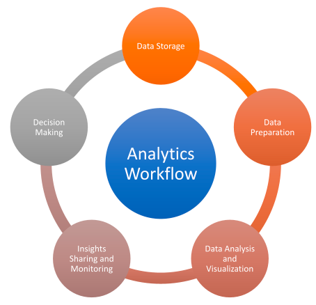
Data Storage
Typically, Tableau is a read-only tool and does not allow you to write back to your original data source. But you can make use of locally or centrally saved subsets of data in the file format TDE (Tableau Data Extracts) or Hyper (Hyper fast and powerful data extracts). When you connect to a data source, you can create data model in the form of a logical layer or physical layer wherein you can join multiple tables from same or different data sources.
Data Preparation
In an ideal world, data is clean and stored correctly. But in the real world, data may not be as clean and as accurate as expected or it might not be in the format that we might be interested in. You might encounter a typo in the salesman name or a missing category in a transaction. Now this can be fixed manually either in the database or while doing the analysis on Tableau. Manual fixes can be done when you are working on a small set of data, but you will need to find a better way to handle this in bulk. That’s when data preparation comes handy. Tableau Prep is a relatively new tool from Tableau which assists in cleaning, shaping and transforming i.e. data prepping as the name says. You can perform your ETL (Extraction Transformation and Loading) activities using Tableau Prep. It allows you to pivot your data, remove empty fields, replace fields, merge fields from different data sources etc. The best part is that this is code-free and can be done using a visual and easy to understand interface. You can save and share your workflow as Tableau Prep Builder Flow (.TFL) or save it along with your data as a TDE, Hyper or Excel file.
Data Analysis and Visualization
Tableau Desktop
Next comes the favorite and the most popular part, data exploration using Tableau Desktop and Tableau Public. Visual exploration using Tableau is the most valuable part of the Tableau Product Cycle. Using Tableau Desktop, you can connect to almost any data source, it can be a flat file such as Excel to a multi-dimensional data source, having millions and millions of records, to even a web data using APIs. Once connected, you get the ability to start exploring your data using a simple to understand and an innovative visual system. Tableau Desktop is where Analysts and Business Users can explore their data, build reports and dashboards and share it within their organization. You can slice and dice your data, create interactive charts, add filters to it and even create governance and access logic using Tableau Desktop. You can share your insights using a single worksheet, a dashboard or even tell a data story. It also allows you to export your findings into Excel, PowerPoint, Image and PDF. You can even see the underlying data.
Tableau Public
Tableau Public Desktop is the free version of Tableau Desktop obviously with some limitation but pretty much has all the required capabilities. The major difference being that files created using Tableau Public Desktop get saved on Tableau Public server which can be accessed by all in the Tableau Community. Hence, it is advised not to create confidential reports using Tableau Public.
Insights Sharing, Accessing and Monitoring
Tableau Server and Tableau Online
Creating reports and dashboards may or may not be a single person’s task. Also, insights once generated need to be shared across your team who could then use is for making data-driven decision making. The most important thing to consider here is to have a safe and secure channel to share the data. You don’t want someone to get access to your critical information and use it in an unsolicited manner. Next, you want to allow others to build on your work and collaborate by asking and answering questions by interacting with the data, filtering the data thereby building their own perspectives about the business problem. Additionally, you want to get alerts about your data, and you would want to have a KPI monitoring system in place. Moreover, you want a robust and scalable system that can withstand 100s of users accessing the visualizations at the same time and can grow with your organization. Lastly, you need a powerful and well-documented management tools so your work can be well maintained without external intervention. This can be done in-house or on-premise using Tableau Server or on a cloud using the pay as you need plan on Tableau Online. They are both essentially the same, except that Tableau Server gives you full access and control of your server hosted in your own data centre whereas Tableau Online is hosted and managed by Tableau.
Tableau Mobile
Whilst most colleagues might work alongside in the office or from another location at their desks, others might be out and about. Here comes another feather from Tableau’s cap, Tableau Mobile! This app allows you to access reports and dashboards on the go from your Android or iOS devices.
Tableau API Connectors
As every business is different, there can be different needs. Tableau recognizes that you might want to use the tools a certain way or might want to connect to other systems. In the IT world this is done using APIs (Application Programming Interfaces) which allows systems to connect and communicate with each other. As of date, Tableau has over 20 APIs and tools which you can explore.
Tableau Reader
Tableau Reader, analogous to PDF readers, lets you open and interact with Tableau workbooks but does not let you edit or create charts like in the desktop. It can be used in the situation where you must quickly share workbook with someone who does not have access to the server. But be mindful that he will be able to see entire content, no security or governance can be applied for Tableau Reader.
Decision Making
Tableau’s interactivity allows user to filter, slice and dice with the data. While the analyst takes care of the storytelling with data, the users can also do self-exploration using the self-service capability of Tableau Desktop, Server and Online.
While Tableau offers a variety of products to suit one’s visual analysis needs, it also keeps innovating and adding features almost every quarter to keep leading in the industry. Tableau releases patches and fixes urgently for security bugs and every month for other issues.
The Tableau Desktop Specialist Certification Practice Exam
Become a Lifetime Tableau Member above at an extremely affordable price to get access to 1000+ questions, continuously Growing, and Unlimited attempts. You will never need to purchase any other test again. But what is the actual reality of data analysis, we often see fancy Sankey diagrams across the social media and in newspapers. Such statistical analysis is often not the usual use-case in the industry, where you might encounter many boring looking reports and dashboards. Less fancy does not mean less insightful. However having the skills to create such fancy diagrams is appreciable, simply due to the expertise that comes with it helps in day to day activities and makes life much easier. Having a certification is not mandatory, but definitely helps standing out from the crowd with demonstrated skills in today's competitive market.
